Have you ever thought of a great idea for an iPod Touch or iPhone theme but just haven’t got your act together to actually figure out how to create one? Well if you have, now is the day that this will all change. In this tutorial from iJailbreak.com you will learn how to create a WinterBoard theme from scratch and throughout this tutorial you will learn basic to advanced WinterBoard concepts. Which will allow you to create a wide variety of WinterBoard themes; making any idea possible. This tutorial will be broken down into three parts because of the pure content that needs to be included in the tutorial. The first part (part 1; the part you are currently viewing) will focus mostly on introducing WinterBoard by showing you – theming concepts, available resources, and you will also will begin your first theme . However before you can begin there are a couple of things you are going to need, to fully follow the tutorial…
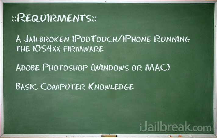
If you take a look at the general requirements of the tutorial most of them are pretty self explanatory. You need a jailbroken iPod Touch or iPhone so you can install WinterBoard and by basic computer knowledge I mean general knowledge of creating folders, browsing the internet, saving images, using a filesystem viewer (WinSCP,CyberDuck) etc.. The only requirement that might troublesome to people is the Adobe Photoshop CS3 or higher requirement. You need this program to edit and create images for your theme, if you do not have this program you can download a free trial of the program from the Adobe website or there are other ways of getting the program. ;) There are also other image editing programs out there for free like Gimp; just note that in this tutorial I will be using Adobe Photoshop CS3, so make sure you can follow along.
Introducing WinterBoard in All of its Glory!
WinterBoard, if you haven’t heard of the application (which I really hope you have if your reading this) is an application created by Saurik to replace SummerBoard; which was the default theming application in the beginning of the 1xx days. A theming application in short is an application that changes the icons of other apps, allows the use of a custom wallpaper, and even allows you to modify the statusbar and dock graphics. Nowadays theming has become a little more advanced in terms of what it can accomplish because there are many ‘tweaks’ available to furthermore customize the look and feel of your iPod Touch or iPhone; which can be integrated into your theme. We will get in to tweaks a little further into this tutorial but for now we are going to begin simple.
How WinterBoard Works
WinterBoard works by hooking into **SpringBoard and overriding its core functionality. This lets it swap out icons at a runtime level without having to actually muck around on the hard drive and swap out the .png files (the iPod Touch/iPhone’s GUI). This, in turn makes it incredibly safe; you don’t have to worry that the guy who created the theme managed to correctly create backups of your original GUI. The theme simply sits entirely in its own self contained folder and can be activated or deactivated on the fly without any dangers of loosing your original GUI. Look at the graph below for a better understanding…
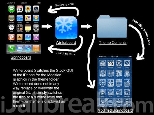
**SpringBoard is basically a built in application that handles how your iPod Touch and iPhone looks and launches applications, it’s like the desktop on your computer.
Hopefully now you have an idea of how Winterboard works. In short Winterboard simply replaces the GUI (Graphical User Interface) on your Springboard with the graphics from your theme folder. Any graphics unspecified in the theme folder will simply result in Winterboard using the original GUI files present on Springboard.
What is a Theme?
Now the whole purpose of this post is to start creating Winterboard themes. However how can you create a theme if you do not even know what a theme is. You have already learned how winterboard works and should now even have a general idea, already of how a theme works. A theme is simply a folder containing specially named images/folders which correspond to images already internally embedded in Springboard. When Winterboard probes through your theme folder it will match the image names and switch the original images for the images in your theme folder. When you create a theme you will name the images that you want to theme corresponding to their original name on Springboard, and you will place them in their appropriate folder. These images also have specified widths and lengths that generally need to be followed (but not always).
Creating your First Theme
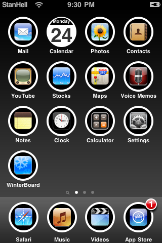
Now that you have a better idea of how both winterboard and theme’s work, you can begin to learn how to create a theme. The first thing you will need before you start following this tutorial is Winterboard. If you do not have winterboard currently installed simply launch Cydia and type in winterboard into the search pane. When winterboard comes up on the search results, simply click it and install it to your iPod Touch or iPhone. Once you have winterboard successfully installed you can begin this tutorial. You can take a look at the finished product that you will be creating in the screenshot depicted below.
Step 1) – The first thing that you are going to do is create a folder on your desktop called “my_theme”. Do this now by right clicking on your desktop, going into new and then clicking create new folder.
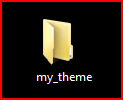
Once you have created a folder for your theme, you are going to create one more folder inside your my_theme folder called “Icons” (Spell it exactly as shown with a capital). You should now have two folders created, one named my_theme and inside of that folder, one named Icons. Once you have these two folders you can continue to step 2.
Step 2) – What you have just set up in step one is your basic theme’s structure. It simply comprises of two folders; when you get more advanced with your theming your theme’s structure will become more complicated. However for now this will be your basic theme’s structure. The next thing you are going to do is launch Adobe Photoshop, and once it is up and running you will see a fairly complicated assortment of tools. The purpose of this tutorial is not to learn how to use Adobe Photoshop, but as you follow this tutorial you will develop some basic Photoshop skills. Do not be overwhelmed with everything presented to you, you will get the hang of using Photoshop by the end of this tutorial. Now, when you have Photoshop up and running go into File > New; you will be creating your first image for your theme, the wallpaper. When you click File >New and a small windows appears; match the settings presented to you to the screenshot below.
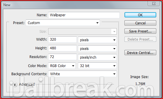
Once you have matched the settings to the screenshot above, click the OK button. The Pixel dimensions that you have just given this blank image are the same dimensions of your iPod Touch/iPhone’s screen. This will ensure that your wallpaper image has exact dimensions to that of your iDevice’s screen. Your Wallpaper image will simply replace the currently black background on your iPod Touch or iPhone. Now that you have your blank wallpaper image, you can make your iPod Touch or iPhone’s background whatever you wish. You can find an image on google and simply copy it into your blank wallpaper image or you can create a gradient background. In this tutorial I am going to show you how to create a gradient background, which will basically comprise of two colors fading into each other. You can take a look at the image you will be creating depicted below…

Step 3) – Creating the background gradient in Photoshop is an easy thing to do. Find the layers box in Photoshop and inside this t box there should be a layer called background with a lock to the right of it.
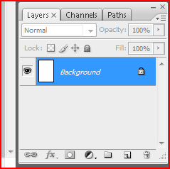
When you see this background layer you are going to need to right click on this layer and click the duplicate layer option. When you click this option a window will pop up asking you what you wish to name this layer. Simply leave the default layer name as it is and then click the OK button. You should see you now have two layers: the Background Layer (with a lock to the right) and the Background Copy layer (with no lock next to it).
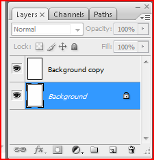
Right click on the Background Layer (the layer with the lock to the right of it) and then click the delete layer button. You should now be left with one layer and this layer is the Background copy layer. You needed to delete the layer with the lock to the right of it because if a layer has a lock symbol next to it, then it means that it is not editable. Now that you have en editable layer, you begin creating your gradient background. Right click on the Background copy layer and click the Blending Options option. When you see a window pop up with a bunch of options/settings you are going to need to go into the gradient overlay tab.
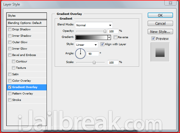
Once you are inside the gradient overlay tab. There are several options that you can play around with. The option that you are going to change is the colors of your gradient overlay. Click on the Faded black to white image beside the reverse button and a new window will appear. This new window is the gradient Editor and this is where you can change the color of your gradient background. I am going to create a dark background in this tutorial, however if you wish to change the colors that is completely up to you. For the theme you are currently creating however I would suggest using the colors that I end up using.
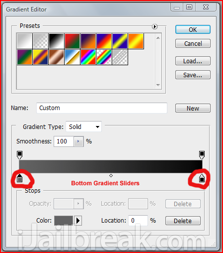
To change the colors of the gradient background you simply need to click on one of the two bottom sliders and yet another window will appear where you can choose the color of your first gradient. Select a color of your gradient and then select another color for your second gradient. Below are the two colors that I chose for my background gradient.
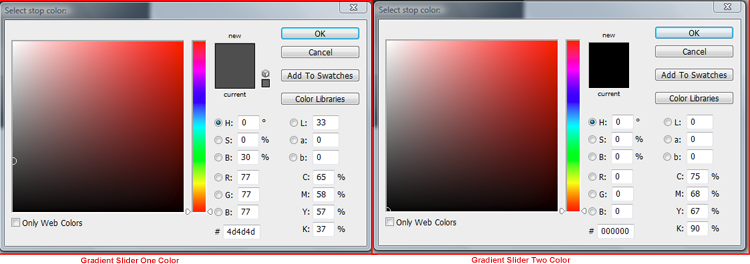
Once you have selected the colors for your background gradient, exit out of all the blending option windows that you opened up and you should be left with your background gradient. As you can see its nothing special but you have created your first image in photoshop!

Now that you have created your wallpaper image in photoshop you are going to have to save it. To do this go into File > Save As, and when the Save As window pops up you are going to want to name your wallpaper image Wallpaper.png (It is very important that you name your image exactly as shown). You will also need to make sure the right format is selected from the drop down list which should be .PNG. Take a look at the screenshot below to reference that you have the right settings selected and save your wallpaper image to your my_theme folder.

Step 4) – Now that you have created your first image for your theme you can now test it out on your iPod Touch/iPhone. To do this you are going to need an iPod Touch/iPhone file-system browser application. There are several of these applications available for both Mac and Windows operating systems. Some of these programs include WinSCP (Windows), iPhoneBrowser (Windows) and Cyberduck (Mac). I am not going to go into detail on how to use these applications because this is not the point of this tutorial. If you need help with these applications Google will be your friend; or follow one of the tutorials listed below…
WinSCP Tutorial (Windows)
iPhone Browser Tutorial (Windows)
CyberDuck Tutorial (Mac)
Once you have found an iPod Touch/iPhone file manager, launch the program and navigate to the following directory:
/private/var/stash/themes.xxx
The directory that you have just navigated to is the directory where all your themes will go into. This is the directory that Winterboard probes for themes and it is important that you remember this directory. Now that you are in the themes directory you are going to need to transfer you theme folder into this directory. Once you have successfully transferred your theme folder to the themes directory you can navigate to Winterboard on your iPod Touch/iPhone. When Winterboard is up and running you should see several menu items presented to you…
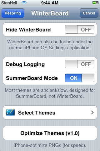
Winterboard will display several options to you when you open Winterboard. Most of these options are fairly straight forward and are described as follows:
- Hide WinterBoard – This will simply hide the Winterboard icon from your springboard. To access WinterBoard with this option enabled you go into the Settings.app.
- Debug Logging – This option is a more advanced option meant for advanced developers who are interested in performance/error logging, associated with advanced themes.
- SummerBoard Mode – Enabling this option will simply allow you to use outdated themes that were originally designed to run on SummerBoard (The Outdated Winterboard).
- Select Themes – This will take you to your current themes that are present in the Themes folder. From here you can enable and disable active themes.
- Optimize Theme (v1.0) – This is an option meant for advanced themes again, that contain many images. Pressing the option will condense your images into a more compressed format for reduced lag, and smoother feel. However when you enable this option your images will not be editable from a desktop computer because they will be converted into a special codec.
The option that you are concerned with right now is the Select Themes option. Go into Select Themes and enable your theme (my_theme), when you see a check mark displayed next to your theme click the home button and your iPod Touch/iPhone will respring. When your iPod Touch/iPhone has successfully resprang you should see your wallpaper in the background of your screen.
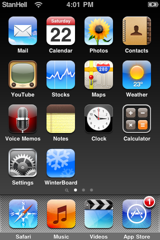
Step 5) – Now that you have created your wallpaper image, you will begin creating your next image and this image is the Dock background. The dock background is the image displayed behind the 4 main icons present at the bottom of your iPod Touch/iPhone’s screen. Go back into photoshop and create a new image with a width of 320px and a height of 91px. When you have entered in those dimensions, name this new image Dock, and then further more you are going to Change the Background Contents option to Transparent. You can take a look at the final dock image that you will be creating below…

Once you have entered in the appropriate dimensions and options make sure your options look similar to the screenshot depicted below and continue…
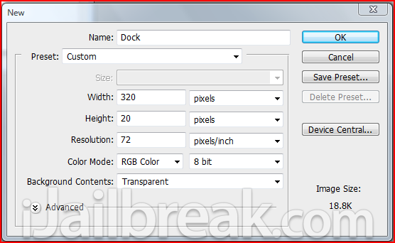
Once you have entered in the appropriate options click the OK button. You should how have a transparent image displayed to you…
**Hint: in photoshop you can tell if an image is transparent by if it has a checkered background.
Now that you have your blank dock image you are going to need to make another background gradient. As your background is already transparent you are going to need to make a square to apply your blending options to. On the left hand side of photoshop you should see a square icon, click this square icon (or press U on your keyboard) and drag out a square to roughly the proportions of your Dock image (it doesn’t need to be perfect).

Now that you have a white square over top of the transparent background you are going to need to right click on the shape 1 layer (this is your squares layer) and go into blending options; as you did for your Wallpaper image. Click the Gradient Overlay option and go into the Gradient Editor by clicking on the fading black to white gradient box. Once you are inside the gradient editor you are going to want your gradient to fade from black (color code #000000) to a grayish color (color code #828282).
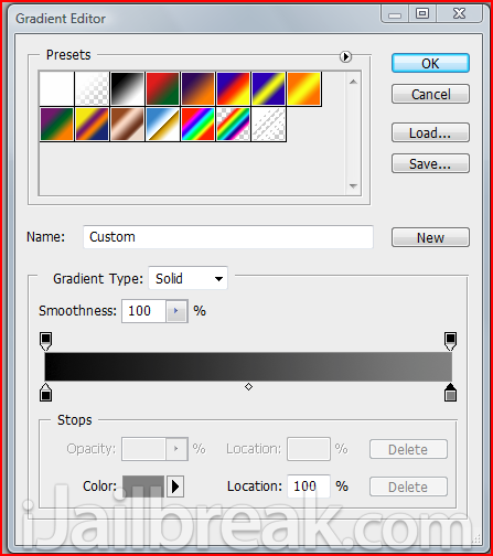
Once you have gotten your gradient to look like the image depicted above click the OK button and close the blending options window. You are now going to need to do one more thing before you are done your dock image. On the bottom right hand of your screen; in the layers box, you should see an Opacity option displayed with 100% next to it. You are going to need to change this Opacity option to 50%, which will make your image slightly transparent. This will allows your wallpaper image to show through your dock image…
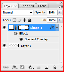
Now you should see your completed dock image which should look something like the image depicted below. When you are satisfied with your image save your image the same way that you saved your wallpaper image (to your my_theme folder), but this time name it Dock.png (exactly as shown). When you have saved your image you are going to drag it over into your my_theme folder on your iPod Touch/iPhone; through your file system browser application.

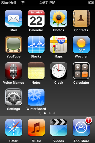
When your Dock.png file has been transferred to your my_theme folder on your iPod Touch/iPhone, go back into winterboard and re-activate your theme by going into the Select Themes option and then by clicking on your theme twice (make sure it has a blue arrow displayed next to it). When you have re-selected your theme click the home button and wait for your iPod Touch/iPhone to respring. When it has successfully resprang your iPod Touch/iPhone should look something like the screenshot below.
Step 6) – Now you have successfully created two images for your theme. The next set of images you are going to create will make up the bulk of your theme and these are the actual icons. Now one of the hardest parts to creating a theme is the actual icons because you need to make enough icons to cover the bare minimum stock icons; at least. Now creating the actual template for your icons will be harder than creating the Wallpaper and Dock images as well. So lets begin…and if you want to take a look at the icon you will be creating you can look at the image below.

The first thing you will need to do is create a new image in Photoshop. Create a new image and name it icon_template and for the dimensions of the image make it 59px wide by 60px tall; this is the default proportions for iPod Touch/iPhone icons. Once you are done doing that also make sure that the Background Contents is set to transparent and that your settings match what is depicted below…
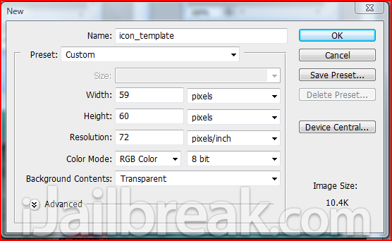
When you are done click the OK button and you should now have a blank transparent image. Now you are going to begin creating the icon_template, in this tutorial you are going to be creating round icons. You will need to click on the square tool again and when you see a drop down box with a circle displayed. Click the circle and begin creating a circle roughly around the same size as your image (don’t worry if you cannot get it perfect you will re-size the circle later).
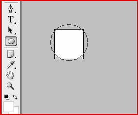
Your circle should also be white and if it is not click on the color box in the layers panel and change the color of your circle to white. The next thing you are going to need to do is size the circle to perfectly fit your image. To do this you are going to need to click on the Move Tool (Press V on your keyboard or it is the first icon on your left hand panel of tools), once you have selected the Move Tool you are going to need to enable Show Transform Controls (In the toolbar on the top of your screen). Once you have enabled this option you should now see white squares on the corners of your image; drag these squares and size your circle perfectly to fit the size of your image.
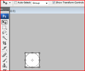
You should now have a circle that fits your image perfectly, and if it does not then go back and edit the circle so that it does. The next thing you are going to be creating is another circle, but this circle is going to be black. Right click on the layer of your white circle and click the duplicate layer option.
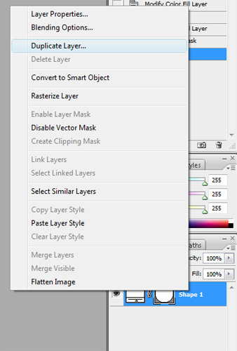
Now that you have duplicated the white circle you are going to change this duplicate circle to black. To do this click on the duplicate circles layer and click to the white box to the left of the layer to the color to black. When you have changed your duplicate circle to black, click the Move Tool again (press V on your keyboard) and then click one of the white squares around the circle (do not re-size the circle yet as you did before). When you click one of the white squares you should see Two boxes in the top toolbar labeled W: 100% and H: 100%. You are going to change both these percentages to 87%, and then center the black circle into the middle of the white circle.
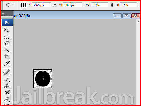
Once you have centered the black circle you should now have two circles; one white circle and one black circle on top of the white circle. This image will act as your template when you are making your icons. Icons are probably one of the hardest parts of the theme to develop because making custom icons requires graphic design experience. Not even I have the experience to develop custom icons, so the easiest way to make simple icons for your theme is to come up with a simple template and then to place the stock app icons over this template. This will make your life a lot easier because there are many icons that you will need to create and having a simple solution to creating icons for your theme will speed your themes creation up. Now actually getting hold of stock app icons may be a little bit of a problem, so I have compiled some main stock icons that you can download below.
Download The Stock Icons Now
Once you have downloaded these stock icons, extract them to your desktop. When they have been successfully extracted the stock_icons.zip go back into Photoshop and click File > Open and select the Mail.png image. When the Mail.png image comes up into photoshop drag the mail icon onto your icon template (the two circles).
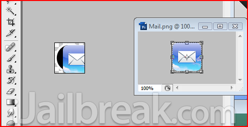
When you have dragged your mail icon onto your icon template you will immediately notice that the mail icon is too big. You will need to re-size your mail icon and to do this simply click on the Move Tool (press V on your keyboard) and follow the same procedure that you used to re-size your black circle (Make Sure Show Transform Controls is Enabled). Click on one of the white squares on the corner of the image and then in the percentages boxes (Width% and Height %) enter 60% into both of these percentages. This will make the icon a workable size, and then you can simply center the icon on the black square.
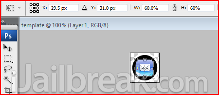
Once you have successfully re-sized and centered the mail icon you have created the first icon for your theme! You will simply need to save this icon as Mail.png (Make sure you enter the name exactly as shown) and transfer the Mail.png to your icons folder inside your my_theme folder on your desktop. Now lastly you are going to need to repeat this process for every icon in your stock_icons folder that you downloaded before. Yes, I know there are a lot of icons but creating a theme takes a lot of time and patience, the icons that I have provided, do not even include games or other apps that users may have installed. So get ready to get your hands dirty and get to work because there are 23 more icons you will need to create.
**Note when you create icons for your theme you need to name the icon specifically to what the applications name shows up as on your ipod touch/iphone (the writing below that specific app). All applications generally begin with a capital, simply look for the application name you are making the icon for and name it that exact name with a .png extension. The icons I provided are already correctly named so just copy their file names if you become lost. It is also important to note that when you are creating a theme for the specific device you are using. there are always extra icons if you have the opposite device, so it is important you consider the icons for the other device.
….feeling lazy? You can Download The Pre-Made Icons Here if you do not want to create all 23! But for the experience I recommend that you do create the icons by scratch.
When you have created all 24 icons you can now transfer them into the icons folder on your iPod Touch/iPhone, via your file system viewer application. When you have transferred all the icons to your iPod Touch/iPhone, re-activate your theme like you did back in step 5 to see your created icons on your iPod Touch/iPhone. When you have re-activated your theme and the springboard has re-sprang you should see something similar to the screenshot below.
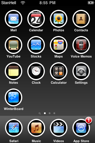
If you are missing icons or some are not themed correctly, this is usually because you did not name them properly. Check to ensure that you used correct capitals and you spelt the applications name right and this should fix any errors you are receiving. If you did get success, congratulations the theme is nearing completion; you have created a custom background image, dock image and a custom set of icons (which was a lot of work!). Now closely take a look at your theme, you may of noticed that the calender icon does not look proper. As you may have noticed the calender icon is a special icon because it has the date and week name overlaying the icon. You will need to edit the calender icon to fix this display error.
Step 7) – To fix the calendar display error you will need to go back into your icon template image. When you are back in your icon template you are going to right click on the black squares layer and click the rastersize layer option. This will simply allow you to erase part of the black square because the image becomes flat (meaning that it looses some of its ability to be edited but it can be erased). Once you have ratersized the black square’s layer you will need to use the Rectangular Marquee Tool (press M on your keyboard or its the icon right underneath the move tool) and select about 3 quarters of the square (look at the image below for an approx example of how much to select).
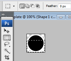
Once you have selected approximatly 3 quarters of the black circle, click the delete button on your keyboard and that portion of the circle will be deleted. You deleted this part of the circle so the date number will be able to show up on the white square. Now that you should be left with a small semi circle, click on the move tool and move that black semi circle up a little ways by pressing the up arrow on your keyboard 3 times. This will allow enough room for the day of the week to show up on the black background.

When you have done all of that save the calender icon as Calender.png and then re-transfer it to the icons folder through your iPod Touch/iPhones file system transfer program. If you have created the icon succesfully and re-activated your theme through Winterboard, your completed theme should look like the screenshot depicted below.
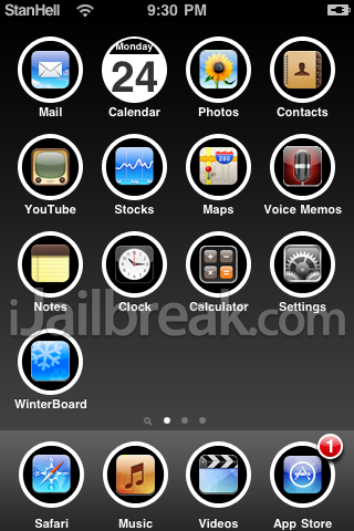
As you can see the changes that you made were not significant but the calender icon looks a lot better than it did before. You have now created a stock icon set, this does not include icons for games or other applications users may have and if you wish to add more icons you may. Simply find the stock icons for other specific games or applications and follow the same steps as you did for creating the stock icon set.
**Note: Make sure that you save your base icon template so you can come back and add more icons if you decide to at a later date. Photoshop has a handy format for being able to come back and edit images called .PSD, and this is the only file format that will allow you to come back and easily add more icons at a later date. Make sure you save your base icon template as a .PSD file before discarding your icon template. Saving it as a .jpg or .png will still save the template but you will not have the freedom of working with layers and other usefull editing tools if you save it as one of those formats.
Conclusion
Hopefully this tutorial has ended up teaching you a lot about theming and how to use Photoshop. The purpose of Part One in this tutorial series was to give you the fundamental knowledge you need to begin getting more advanced in both Part 2 and Part 3. You have covered a lot of ground in part one of this tutorial and hopefully you had some fun along the way. Below is the main images that you themed that you will need to memorize when creating themes.
Wallpaper.png – This image will replace the currently black background of your iPod Touch or iPhone.
Dock.png – This image will replace the graphic displayed behind the four main icons present at the bottom of your iPod Touch/iPhone’s screen.
Icons – The icons go in a specific folder named Icons, they are simply named as they are displayed on your iPod Touch/iPhone’s springboard. For example Mail.png, Music.png, App Store.png, WinterBoard.png etc…
If you made it to the end of this tutorial, congratulations.. it was one long tutorial! As always if you struggle or are having some problems with the content covered in this tutorial you can leave any questions/comments in the comments section below. If you are wondering about Part Two, it will hopefully be released within the next month.
WOW!!! I had no idea so much work needed to be done to create a theme.
this is amazing! :D
But where’s Part 2 & 3?
Ahaha if I can get around to it one of these days ;) Any suggestions on what you would like to see?
One question-excellent tutorial but how do you know if your files have been imported on iPhoneBrowser?
(Worked it out)
Just wanted to mention- you need to create the photoshop file as an 8-bit, not a 32-bit file in order to save it as a PNG.
Just wanted to mention- you need to create the photoshop file as an 8-bit, not a 32-bit file in order to save it as a PNG.
wow, great tutorial..
I just created my own theme..
I can’t wait to read part 2 and 3.
Ideas..:
something with the batteryscreen and the scrollbar bullets?
How to make a different phone dialer.
How to link icons to apps with hard names (Office² Plus, Pathé (dutch movietheather), my icons aren’t showing cause of the ² and é..)
Out of ideas right now..
Just another question: how can I link an icon to a shortcut from Safari (site -> Add to homescreen)
Keep up the good work ;-)
PS. @google-fa7677ded384a2b0085a22c8e710aed5:disqus 16-bit is also working..
Very in-depth and clear guide!
Thanks very much for the info
So what next? Would love to see the rest of it please :c
i did this…and i even used the icons provided…but still my icons have not changed
the background did, but the icons are still classic!
i used the download you provided so what could be the probem?
How do you make a slider?
Make sure winterboard is on summerboard mode…
believe me it takes a long time…
first u make a folder called “Bundles” inside ur theme, than you make another folder named “com.apple.TelephonyUI”. Than take out ur photoshop thingie and make the background transparent and make the size 79X49, than make the photo that u want (if u want it to be the main slider than name it “bottombarknobgray.png” and if u want it the shutdown slider than name it “bottombarknobred”).
By the way the photoshop thing I used was GIMP… use it preferably. :)
I cant get it to change the wallpaper..
Yea, The same thing happened to me.
Why can’t I get the dock to change?
Anyone know where parts 2 and 3 are?
I can get the wallpaper to change, but not the dock..Anyone know what I might be doing wrong?
hey, how am i supposed to change the status bar color and other things like that? also the effect of when you unlock the ipad, instead of looking like it’s opening, I want to make it look as if it’s scattering.
I can’t get the dock to change? It’s on 8-bit, saved as you did. same size, same name. Can anyone help please?
I got the same problem… does this tutorial work with iOS 5.1.1???
im on ios 5.1.1… Before I start theming do I have to downgrade to ios4 to get ios 4xx? please help . I need to know before i start
I have the same problem. But for most things if it isn’t working, try doubling the resolution (i.e. if the current res is 240 x 120 change it to 480 x 240) and adding “@2x” (without the quotes) to the end of the file name (i.e. Dock@2x.png NOT Dock.png@2x)
i don’t think u need to, i think it’s ok fo 4.x and higher
Okay, so I am aware this tutorial is slightly old, but I’m confused. I no longer have a dock, no matter the theme I go to, and I still can’t seem to get the dock on there. iFile tells me that it has been successful in the transfer, and it even shows me the picture, but I am still not able to get the dock on.
does anyone no where i can download a torrent for adobe photoshop????
no download link for stock icons :(
where are the other parts?
I can’t get the icons to change!I saved it exactly as “Mail.png” in the “Icons” folder! Help!!!!
know* buy it, it’s worth it and supports the developers as a torrent does not.
can’t get the icon link to show up