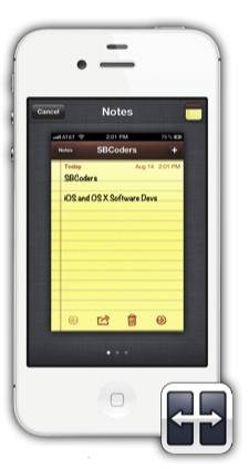
Dash is self-described multitasking revamp for the iPhone and iPod touch which replaces the standard multitasking tray. Instead of putting icons of previously used apps in a tray below the screen, Dash allows users to swipe between cards which represent open apps.
These cards contain screenshots and icons of the apps they represent. Users flip between open cards with swipes, on a SpringBoard-like interface. The animation between the cards can be set under Settings -> Dash -> animation. There’s there basic scroll animation, animations which mimic coverflow and time machine, and two others labelled Rotary and Cylinder.
The activation method can be set as a double-press of the home button in order to replace the multitasking tray, but if can also be set to activate through a different method if you still want to use the default app switcher from time to time.
It is important to keep in mind that multitasking tweaks have been available in Cydia for a long time, and Dash is a new addition to the genre. The current gold standard for multitasking on the iPhone is Zephyr, by Chpwn. Zephyr is more transparent than Dash, as Zephyr doesn’t need to be called up; instead it allows users to directly swipe between open apps. If you’re using an iPad, you may be more interested in Quasar, which allows for actual side-by-side multitasking in separate panes.

Dash displaying a card for notes.
Dash is only $1.99 and early in development. It’s different enough from Zephyr that I wouldn’t call it a copy-cat app, and it might be what you’re looking for in a multitasking tweak. You can find dash in the ModMyi repository.
What sort of multitasking do you use? The default method, a custom tray, gestures, true side-by-side multitasking, or do you disable multitasking altogether to save battery life? Share your thoughts in the comments section below.
i just use fucking SbSetting in Multitasking it`s bore and weak but it made it i will try Dash it looks awsome Thx