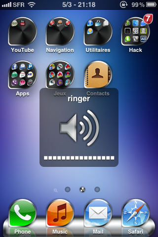
DeForm HD SD‘s Cydia page explains that the theme was based around the letter D. It’s beyond me why someone would want all their icons shaped like Ds. (Who’d want a D? That’s barely a passing grade in school.) Lucky for us the icons in DeForm HD SD look more like guitar picks, which fit in better with the iPhone’s media player lineage.

The app icons look cool when they work, although some remain square; the other gradients used in this theme (such as the ringer icon) are inconsistent with the rest of the design.
The theme’s icons look cool, but are little more than App Store icons with three corners rounded down into a teardrop shape. The theme doesn’t seem to support some Cydia apps; unless you put the left out apps into their own folder, you’ll be left with an odd-looking mix and match. Overall the icons look cool.
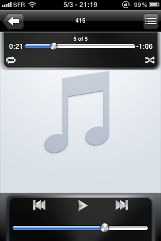
The rest of the theme is ugly and inconsistant. The theme is covered with rendered brushed-metal accents and odd-looking gradients. The marble skin applied to the play and forward buttons, in particular, is really out of place. (What do brushed metal and marble have to do with the letter D?) It seems as if the theme’s developer had one interesting idea, and cobbled together the rest of the theme without putting any thought to a unifying design.

The textures used in this theme don't look good, match, or have anything particular to do with the letter D.
The good news is the AppLaunch images are separate from the theme. DeForm HD SD is available in the Cydia App Store for $1.99. If you’re really into guitars, it might be an interesting icon set to play with.
Would you add DeForm HD SD to your guitar pick collection? Let us know in the comments section below.
it’s ugly.