The iPhone, iPad, and iPod touch share an impeccably designed operating system. The problem is that sometimes Apple’s designers pick form over function. While the page dots on the SpringBoard look great, if you have a lot of pages then the dots become less useful. Those wasted moments are a barrier to learning which page your most used apps are on, and can lead to fumbling with the device.

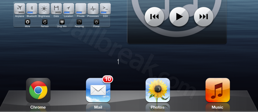
The PageNumbers Cydia Tweak seems to be an attempt to address this problem. The tweak gives you all the advantages of counting numbers over dots. It replaces each page’s dot with a number, which it displays when you’re on the page. With the tweak installed, you’ll instantly know if you’re on page 7 or page 8.
The biggest problem is that PageNumbers sacrifices too much in the way of form to provide enhanced function. Since the numbers seem to be a simple re-skin of the original page dots, the numbers float to wherever their corresponding dots would have been (leaving the inactive dots invisible). This means that the numbers are not centered. This just doesn’t look good.
The design looks worse on Retina display devices. The numbers appear blurry, as if they were made in low resolution.
This is an example of a concept which I think is really strong, but is hampered by its execution. There are a number of possible ways to improve PageNumbers. The easiest way would be to reskin the page dots so that the inactive dots are unmodified but the active dot is replaced with a small numeral. Another possibility is to create a tweak to entirely rework the page number display such that a single number can be centered on each page, but this would require a more extensive tweak.

The page numbers may be practical, but they could use some design work.
If you want to try PageNumbers you can find it in the BigBoss repository on Cydia for free. The tweak works with iOS 5 and up.
How do you think page numbers should be displayed on the SpringBoard? Share your thoughts in the comments section below.
Leave a Reply