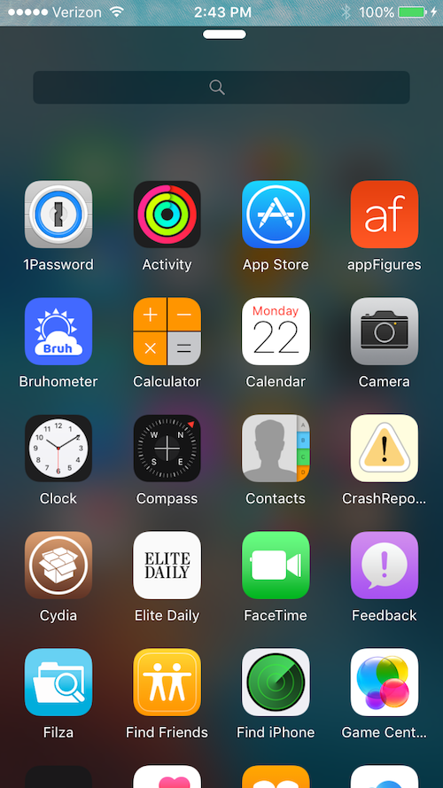
Vinculum, on the ModMyi repo, is a different view on Control Centre on iOS entirely, however is it a good one? With no functional controls, or utilities, it certainly isn’t for everyone!
Vinculum’s inspiration comes from the Google Nexus Nougat App Drawer, something which some users certainly prefer. An alternative to this, is the Win10 theme I covered earlier in the week.
Like Control Centre, simply swipe up from the dock, not the bottom of the screen and there you have it, a great, simple list of all your installed apps. However, there is more!
Simply hold down on any application within the app drawer to hide it, no respring, no fancy ‘in, out, move around, into a folder’ tricks just a simple hide. If there’s an app you definitely don’t want appearing at the top, or in your search, then this is a must! This is of course reversible and you can bring an app back from within the settings.

With a very simple configuration menu, and a very easy use, you’ll soon start to rely on it. Combined with a very useful search function which still allows browsing of the rest of your apps (Windows take note!!) at the same time, it’s great for narrowing down what you’re looking for.
It is currently only at Version 1 and the developer is promising great things so this is definitely something that you want to go and check out.
There is also a ‘dark or light theme’ to this, which fantasists of the Apple Dark mode I am sure will fall for immediately.

Mimicking a ‘control centre’ themed ‘pull bar’ you will struggle after a while to believe that actually, this wasn’t built into the OS in the first place and what have Apple been doing with their time.
With potential developments including 3D touch support definitely a possibility, don’t miss out!
Leave a comment below if you find this useful instead of relying on spotlight or manually sifting through those numerous pages of Apps. As always, feel free to get in contact via social media.
Leave a Reply