As expected, Apple went ahead and pulled the wraps of OS X 10.10 at WWDC 2014 today. They’re calling the newest version of OS X as ‘Yosemite,’ after the Yosemite National Park. We guessed the name when we noticed that background on OS X 10.10 banners around Moscone Center.
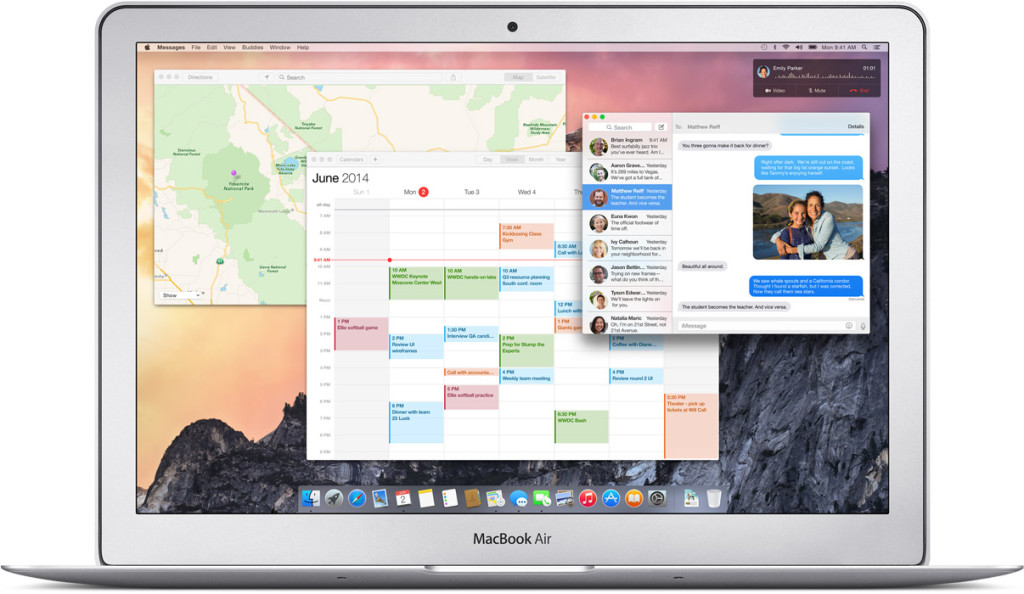
CEO Tim Cook started the Keynote with the usual stats on Mac OS X. Despite the computer industry seeing a drop, Mac grew by 20 percent overall. Around 80 million Macs have been installed so far, and 40 million of them are running on OS X Mavericks. Whereas on the Windows platform, only 14 percent of Windows machines run on the latest Windows 8 OS.
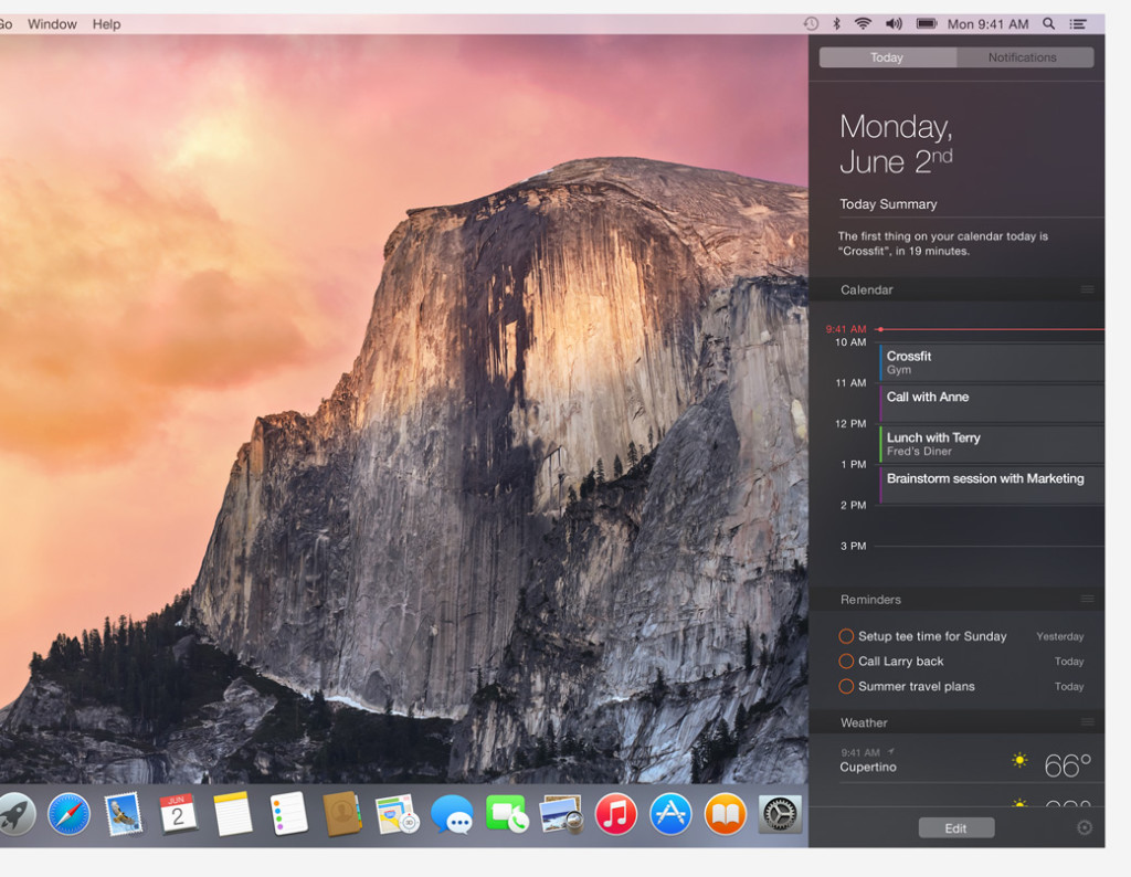
Let’s talk about what’s new in OS X 10.10. Firstly, you’ll get an iOS 7 feel throughout the OS, with translucency, new typography and more. The Notification Center can now show Widgets from different apps, the Spotlight search is available anywhere on the screen from right under the mouse cursor and there’s also a brand new Dark Mode UI.
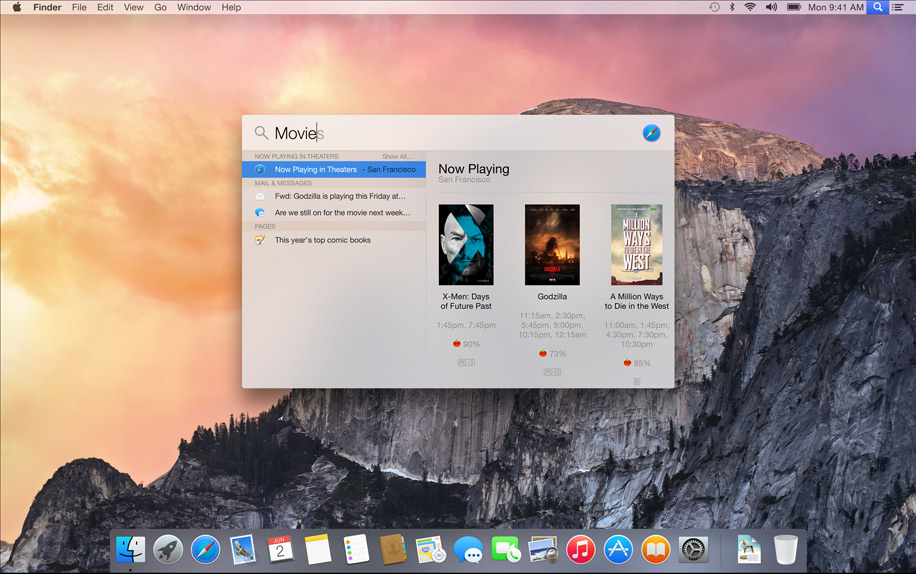
Spotlight search is greatly improved, as it’ll not only search local files, but also do an online search regarding the keyword and give you more information. Searching for a contact will reveal recent documents, messages etc. that has the contact name in it. Search for a movie and it’ll also show you theaters it’s playing in, reviews and more.
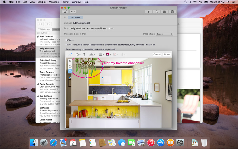
The Mail app gets a lot of improvements such as larger file transfers with a feature known as MailDrop. Another feature called Markup lets you touch up attachments without the use of a third party app.
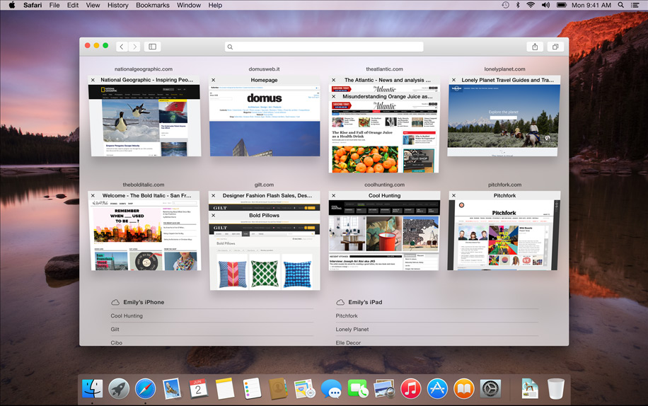
Safari for Mac gets a new look with better Tab view, suggestion snippets for all your Spotlight and Smart search suggestions in one place, and can subscribe to RSS feeds directly from a shared link. You can now open a Private window right next to your Normal window and the browser now supports SPDY, WebGL, HTML5 Premium Video and other new streaming technologies. It’s also more power efficient, providing an extra two hours on your MacBook while streaming Netflix.
OS X Yosemite also comes with another new feature called Continuity, which lets you seamlessly connect with your iOS devices and vice versa.
If you’re an Apple developer and are enrolled in the developer program, you can download the Mac OS X 10.10 developer preview right now from the Mac Dev Center.
The public release will come sometime this fall, with developer betas coming out during the summer.
What do you think of OS X Yosemite? Let us know in the comments…
I have installed Yosemite on my retina MacBook, and I am HIGHLY impressed. Not a big fan of the flat look, but the new features are GREAT!!! Safari looks and performs AWESOME-I really liked when Mountain Lion made the search and URL bar one and the same, and now to have it smaller and centered, it looks even better. Notification Center allows add-ons (which kicks a$$), and even though it’s a flat design, the UI is surprisingly crisp and defined, and the new font gives it an iOS feel (especially with Notification Center). You even have the option to send voice messages in iMessage. I noticed a power nap setting in energy saver, which is a pretty cool feature. The little dots under the apps to tell you what is running in the background in the dock are quite handy as well. The sidebar in finder is unbelievably crisp and defined.overflow is even revamped, and looks great!! The only problems I’ve had thus far are playing video, iMovie doesn’t work, and photo booth just has a question mark..Neither Quicktime or VLC play correctly, but then again..this is a VERY early version. Overall, these are some really impressive moves by Apple. I’m anxious to see what the GM looks like!!! The biggest problem I have now is going to work and having to use that ugly, slow, disaster-of-an-OS Windows computer!!!!